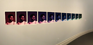
The exhibition name is Somewhere Behind, Somewhere Ahead. The theme for the exhibit was the reflection of changes in our surroundings through the eyes of the new emerging generation. The goal of the exhibit was to get high schoolers involved in the museum side of the art world. It was done to open up the concept of art curation to a younger crowd of students.
Ambient lighting was used. Many the pieces where inside of cases. These cases had their own lighting. It was all very soft and not over powering for the eyes. The walls were either white or a very pale baby blue. A lot of windows where used to create the boxes I described before. The window boxes are cool because it forces angles of viewing. The way some of the painting were displayed inside of them was very dynamic as well. The some paintings where on opposite walls looking at one another inside the window boxes. There was also a pedestal box for one of the piece. The curved wall that was painted blue had many pinned up images. The rainbow portrait fit very well with the curve of the wall. The movement through the exhibit was very smooth. It starts at one end and ends at another or vice versa. Viewers may stay stagnant for a while because many of the pieces are close together.
The artworks were organized relatively close to one another. Some paintings faced one another so the viewers POV was limited to certain angles. The 3-D piece on the pedestal was displayed so you could walk all around it. There were 3 larger pieces on the curved wall. None of these where framed. However many of the paintings and mixed media art works in the window boxes were framed. The types of frames varied with each art work. Some of the frames helped develop the artwork more, other frames looked like the art work was framed just to frame it, not to compliment the work. All of the images reflected the same theme. All of them were done by college students. Many of the art works had human subjects, but not all. The sculptural pieces didn’t display any people. All of the art works were labeled. The each had a white text box with the name of the art work, the mediums used, their high school, the artist’s name, and occasionally a description.
I enjoyed this visit a lot. I took a friend that had never been and this exhibit was a new thing for the both of us. I was honestly my favorite. Being student’s art work, I was very impressed. I also connected with the theme a lot. The different displays were intriguing and made me want to look longer. It was a small space but used very well and the movement in the area flowed well.
ANALYZED ART WORKS


No comments:
Post a Comment